At Floresta Partners, color is experiential. Each palette we embrace tells a story of emotion, atmosphere, and purpose. For Autumn/Winter 2026–2027, these selections reflect a season shaped by dualities: comfort and confidence, nostalgia and innovation, stillness and vitality. These tones aren’t just trends—they’re tools for connection, crafted to enrich the spaces we shape and the lives they hold.
Velvet Minimalism
This season, Floresta Partners reimagines glamour as a feeling—not a performance. Velvet minimalism brings a sense of quiet richness, where intimacy takes precedence over spectacle. Saturated and sensuous, this palette is about atmosphere—lush fabrics, layered textures, and immersive environments that invite touch, stillness, and emotional depth.
Perfect for elevated hospitality, luxury retail, and evening-focused spaces, these hues celebrate craftsmanship over opulence. We design with restraint, allowing depth and materiality to shine through—timeless, intentional, and deeply refined.
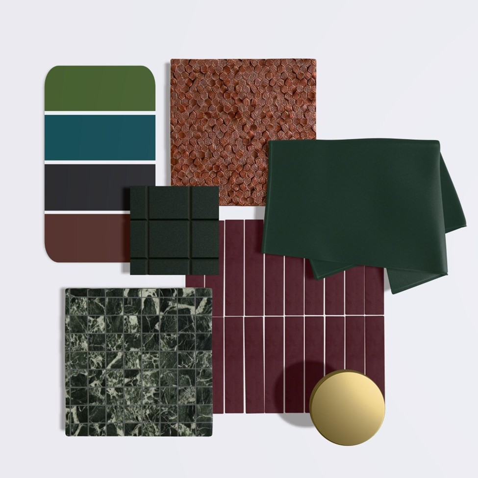
Berry-Brilliant Escapism
Joy is a design essential—and Floresta Partners believes in creating environments that uplift. Berry brilliance offers a palette of saturated berry tones that feel both spirited and grounded. Inspired by hedgerow harvests, preserved fruits, and layered flavors, these hues invite play and imagination with a soulful twist.
We see this palette as a way to create emotionally intelligent spaces—joyful but not juvenile, expressive yet elegant. It’s a celebration of color as nourishment, a sensory antidote to a fast-paced world. In our hands, optimism becomes immersive, textural, and transportive.
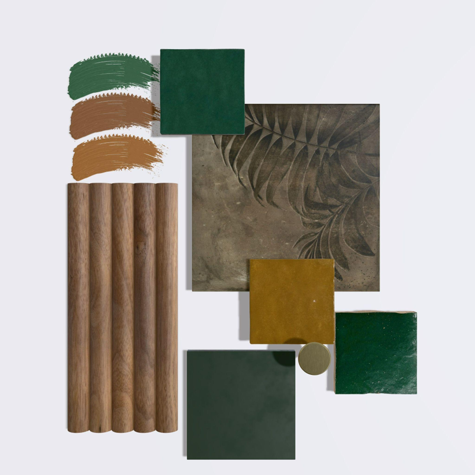
The New Natural
At Floresta Partners, we value what lasts. The new natural reflects our enduring belief in design that honors heritage, material honesty, and environmental mindfulness. These earthy hues—deep forest greens, nutmeg browns, and burnished golds—capture the beauty of restraint, redefined through a modern lens.
This palette offers a refined evolution of the natural—minimal, not austere; rich, but never excessive. It pairs beautifully with reclaimed materials, tactile finishes, and thoughtful layering. For clients seeking timeless spaces that evoke calm and purpose, this is a palette designed to resonate.
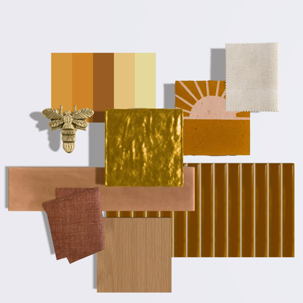
Bottled Light
Bottled light shines with quiet optimism—a palette that glows from within. Tones that feel like comfort, generosity, and warmth made visible. From honeyed ambers to mellow ochres, these colors are rich in feeling and full of life.
Ideal for interiors where connection and uplift are essential, bottled light radiates slow joy and soft energy. This is where retro familiarity meets modern spirit—color that soothes, invites, and uplifts without overwhelm.
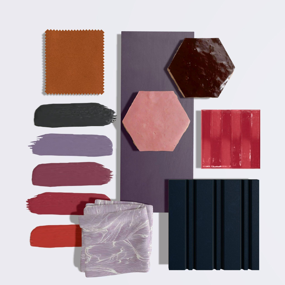
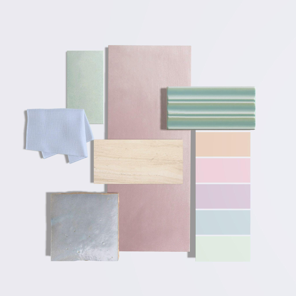
Pastel Precision
As advocates for emotional clarity and sensory balance, Floresta Partners embraces the pastel precision palette as a new frontier in color design. These evolved pastels bridge the space between innovation and serenity—misted greens, gentle peach, and feathered lilac that lend calm to overstimulated environments.
Perfect for wellness, hospitality, and workspaces seeking restorative energy, these tones act as visual breathwork—gentle, smart, and precise. Here, technology and tenderness meet, with color playing the role of quiet support in a world of constant input.
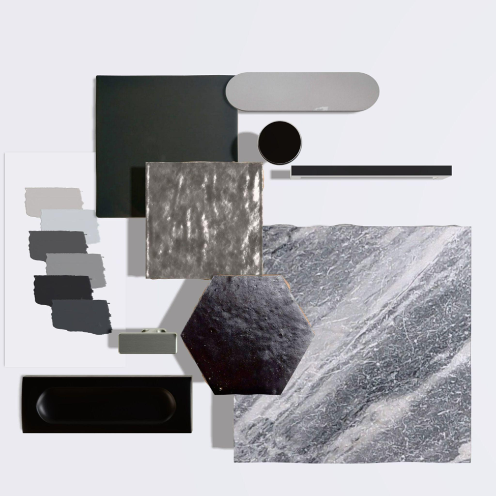
Elemental Luxe
Timeless. Elemental. Resilient. Elemental luxe speaks to Floresta Partners’ ongoing exploration of luxury rooted in place and permanence. These deep grays and muted metallics channel the raw beauty of mineral forms—slate, lead, iron—and the quiet power of the earth itself. This palette brings gravitas to any space, balancing brutal elegance with sensual tactility. Ideal for projects seeking modern legacy, these shades serve as anchors—supporting both trend-led accents and classic design. It’s modernism with soul. Materiality with memory. Luxury that lasts.
Designing with Intention
At Floresta Partners we choose each shade with purpose—to elicit emotion, to guide experience, and to craft environments that matter. The Autumn/Winter 2026–2027 palettes reflect our belief in design as storytelling: nuanced, human-centered, and enduring.
These hues are more than seasonal—they’re signals of what people truly need: warmth, grounding, joy, and beauty that feels deeply personal.