At Floresta Partners, every design choice is rooted in the belief that spaces should do more than look beautiful—they should feel restorative, inclusive, and deeply human. The Colors of Kindness embody that belief. These nuanced tones offer more than aesthetic appeal—they deliver emotional resonance, sensory comfort, and a sense of well-being that invites people to slow down and settle in.
Softness You Can See and Feel
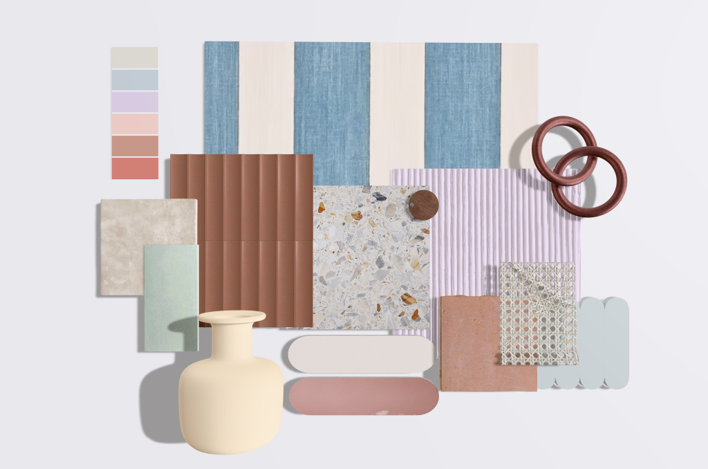
There is something uniquely sensorial about the Colors of Kindness—a visual softness that feels almost tangible, like velvet under the fingertips. These hues conjure plush textures and sun-warmed materials that seem to wrap around us with ease, even when experienced from a distance. At Floresta Partners, we often draw from the natural world to inform our palettes, and this one is no exception. Gentle pinks, sun-drenched mid-tones, airy blues, creamy neutrals, and whisper-soft whites speak in hushed tones. They don’t demand space—they offer it. And in doing so, they create small yet meaningful moments of emotional restoration.
A Reflection of Our Philosophy
Design is never arbitrary at Floresta Partners. We see color as a powerful emotional tool—one that can uplift, soothe, and reconnect. As explored in our recent reflection on Pantone’s Color of the Year, Mocha Mousse, we’re drawn to tones that encourage balance and mindfulness. The Colors of Kindness continue that conversation: they are compassionate, calming, and quietly confident. These shades don’t compete for attention—they complement the lives lived within the spaces we design.
Practical Beauty, Purposeful Application
Our approach to interiors is both empathetic and strategic—each decision grounded in how people experience space. The Colors of Kindness are deeply versatile and align with our vision for environments that prioritize emotional well-being. Here’s how Floresta Partners recommends using this palette:
● Tactile Harmony
These hues shine alongside soft, matte textures. Think brushed finishes, unglazed ceramics, velvets, and natural fabrics. A low-sheen surface deepens the visual softness, reinforcing their calming effect.
● A New Neutral
Instead of defaulting to stark neutrals, consider these shades as an alternative base. They provide structure without harshness—perfect for spaces that aim to soothe rather than stimulate.
● Design for Inclusivity
Kindness colors are especially effective in creating environments that are welcoming and accessible. Their gentle, non-intrusive nature supports neurodiverse individuals and anyone seeking refuge from visual noise.
Designing with Care, Always
For Floresta Partners, the future of design is empathetic. It’s built on a foundation of warmth, softness, and intentionality. The Colors of Kindness embody this future. They’re more than a palette—they’re a reflection of how we believe interiors should make people feel: supported, grounded, and at peace. As we continue to create environments that balance beauty with well-being, Floresta Partners celebrates these tones as quiet heroes of design—proof that the most powerful statements are often made in whispers.